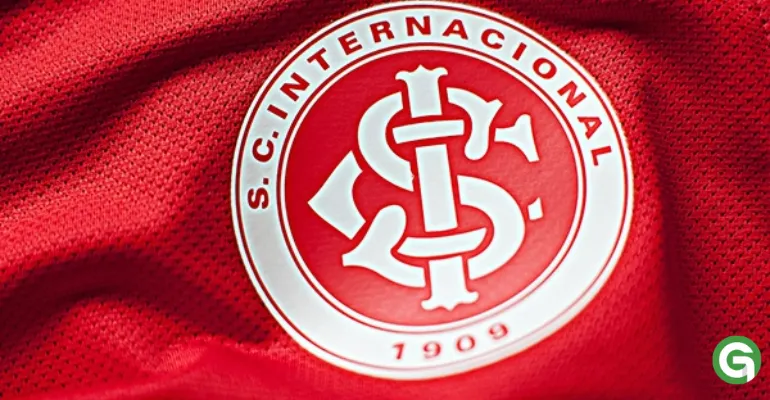
The shield of Sport Club Internacional is one of the most representative symbols of Brazilian football, embodying the strength, the tradition, and the passion of its supporters. Over the years, the shield has undergone various modifications but has always retained its core characteristics.

BRG365! Let's dive into this story.
History and Origin of the Internacional Shield
The shield of SC Internacional dates back to the early years of the club, founded in 1909. At that time, the design of the shield was quite simple, composed of the letters "SCI" and a red circle, reflecting the club's colors. This initial design symbolized the emergence of the club in the football scene of Rio Grande do Sul, still in the process of building its identity.
➡️ Next Internacional game 2025: see the dates, times, and where to watch
Despite several changes over the years, the shield has always maintained the letters "SCI" and red as its predominant colors. This choice was inspired by European clubs, where red symbolized strength and passion, as well as being a tribute to the club's founders.

The Evolution of the Internacional Shield
In the early years of the club's existence, the shield underwent minor modifications to align with the design trends of the time, always maintaining the essence of its identity. In 1939, the club began to adopt a more refined version of the shield, with a white outline around the letters "SCI", which gave the design a more modern and elegant appearance. This version was quickly accepted by the fans and became the "classic shield" of Internacional.
➡️Titles of Internacional: Historical Titles of the Club
In 1945, the shield underwent a significant redesign. The letters "SCI" were redrawn to stand out more, and the white border was replaced with a golden border, symbolizing the grandeur and ambitions of the club. This design was maintained through the following decades, consolidating the shield as one of the greatest symbols of the team.

The Current Shield of Internacional
The shield that Internacional currently uses was introduced in the 1990s and remains unchanged to this day. While it retains the main elements of previous versions — such as the red circle and the letters "SCI" in the center — the aesthetics have been modernized. The lines have been softened, and the design has become more streamlined, offering a more contemporary appearance.

The red remains the predominant color of the shield, representing the passion and strength of the club and its supporters. The white outline around the circle reinforces the idea of unity and continuity, while the letters "SCI" represent the club's commitment to its history and roots.
Recommended Reading: