As one of the most beloved teams in the Indian Premier League, Royal Challengers Bangalore has captivated fans not just with its on-field spirit but also through its iconic cricket logo.
Over 16 years, the RCB cricket logo has undergone three major transformations, each reflecting the team’s growth, cultural ties, and evolving brand identity.
Join us as we explore how this visual symbol has become a cornerstone of RCB’s legacy.
Don’t forget to follow BRG365 for more insightful stories about your favorite cricket logo!

The Birth of a Royal Symbol(2008–2015)
When RCB joined the IPL in 2008, their cricket logo aimed to make a bold statement.
Designed under the ownership of United Spirits, the initial logo was a regal circular medallion, symbolizing “royalty” and “grandeur” as core brand values.
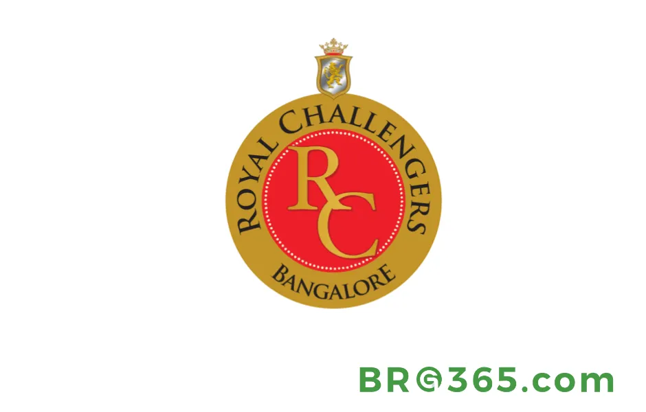
At its center sat a gold “RC” monogram, encased in a dotted red and gold border, with “ROYAL CHALLENGERS BANGALORE” written in bold black serif letters around the edge.
Above it all: a silver crown atop a lion crest, representing power and nobility.
This design screamed “luxury,” fitting for a team named after a premium spirit brand. The mix of gold, red, and silver felt opulent, almost like a royal coat of arms.
While intricate, it lacked the punch needed for digital spaces—a detail that would later drive a redesign.
In 2011, under the original logo, RCB reached their first IPL final against Chennai Super Kings (CSK).
Despite Chris Gayle’s explosive 63 runs and Virat Kohli’s gritty 35, RCB fell short by 58 runs.
The match highlighted the team’s early potential but also exposed vulnerabilities in high-pressure scenarios. The crest’s crown and lion, though majestic, struggled to translate into trophy success during this era.
Key Elements
|
Feature |
Design Choice |
Symbolism |
|---|---|---|
|
Shape |
Circular medallion |
Unity and tradition |
|
Colors |
Gold, red, silver, black |
Royalty, energy, elegance |
|
Mascot |
Crown-wearing lion crest |
Strength and leadership |
Modernizing the Pride(2016–2019)
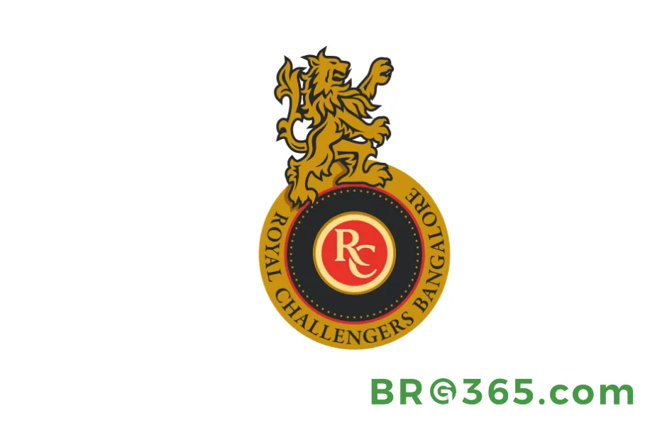
By 2016, RCB recognized the need to adapt its cricket logo for a younger, digital-first fanbase.
The redesign kept the circular frame but injected modernity: a bold black outline now framed the logo, while the lion crest evolved into a dynamic, two-legged golden lion—standing tall, ready to attack.
The “RC” monogram switched to a white-and-gold gradient, and the team name adopted a cleaner, sans-serif font.
This phase felt like RCB shedding its “old-world” skin. The aggressive lion posture mirrored the team’s competitive spirit, while the black accents added edge.
It was a smart move: the simplified lines made the logo pop on jerseys and social media, connecting better with fans under 30.
The 2016 IPL final against Sunrisers Hyderabad (SRH) became a defining moment for the redesigned logo.
Despite Chris Gayle’s blistering 76 runs and Virat Kohli’s 54, RCB lost by 8 runs . Ben Cutting’s heroics for SRH overshadowed RCB’s attacking brand of cricket.
The logo’s “attacking lion” symbolized RCB’s fearless approach, but the defeat highlighted the gap between ambition and execution.
Read More: Inside IPL RCB Team: How a Team Without a Title Captivated Millions
Key Changes
-
Lion Redesign: From static crest to dynamic “attack pose”
-
Color Shift: Darker blacks and muted golds for modern appeal
-
Font Update: Sans-serif typography for readability
Rooted in the City(2020–Present)
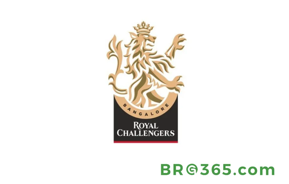
The biggest shakeup came in 2020 when RCB ditched the circle entirely for a vertical, rectangular layout.
The lion—now larger and more muscular—took center stage at the top, while a golden arch below framed “BANGALORE” in bold black letters.
The team name “ROYAL CHALLENGERS” sat at the bottom, underlined by a thin red line.
In 2024, with the city’s official name change to “BENGALURU,” the logo adapted again, solidifying its local identity.
This redesign was a masterstroke. By prioritizing “Bengaluru” (over “Royal Challengers”), RCB showed it’s more than a brand—it’s a city’s pride.
The minimalistic black-and-gold palette feels timeless, and the lion’s dominance reflects a team hungry to win.
Plus, the vertical format works perfectly for jersey branding and mobile screens.
In a 2020 league match against Mumbai Indians (MI), RCB’s new logo witnessed a thrilling Super Over victory.
Chasing 202, RCB fell short by 1 run in regulation but clinched the win when Virat Kohli smashed a boundary off Kieron Pollard’s final ball .
The logo’s bold, urban design mirrored the team’s never-say-die attitude, proving that even without silverware, RCB’s fighting spirit resonates deeply with fans.
2024 Update
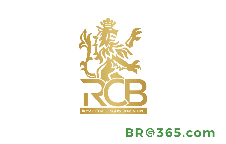
-
Name Change: “BANGALORE” → “BENGALURU” to align with official city spelling
-
Color Palette: Stripped-back gold, black, and red for maximum impact
Read More: IPL Squad 2025: Take some Mid-Season Adjustments – Can the RCB Finally Conquer?
Why the RCB Cricket Logo Matters
Here’s how each phase embodies key themes:
-
Consistency in Core Values: The lion and crown have remained constant, symbolizing resilience and ambition across every iteration.
-
Adapting to Fan Culture: From royal elegance in 2008 to urban grit in 2020, each redesign actively responded to fan feedback and cultural shifts in sports branding.
-
City Pride: By embracing “Bengaluru” in 2024, RCB transformed its logo into a badge of local identity, turning every match into a celebration of the city’s spirit.
The 2008 version feels like a chapter from a historical novel, while the 2024 design is pure modern-day swagger.
It’s a reminder that sports logos aren’t just logos—they’re living symbols that grow with their teams and communities.
Lion’s Roar in the Digital Age
From a regal medallion to a bold urban emblem, the RCB cricket logo has evolved into one of the IPL’s most recognizable symbols.
Each iteration shows a team unafraid to rethink its identity while staying true to its roots.
As RCB continues chasing that elusive IPL trophy in 2025, one thing’s for sure: their logo will remain a powerful symbol of pride, passion, and the never-say-die spirit of Bangalore cricket.
Also Read: RCB unveils new name, logo and jersey