The Corinthians emblem is one of the most significant landmarks in the club's history. Founded on September 1, 1910 by five workers in the Bom Retiro community, in São Paulo, the Corinthians emblem has undergone numerous changes over the course of 113 years, until adopting the modified model created by the artist Orfeu Domingues Alves Maia in the 1980s. Now, let’s explore how the history of the Corinthians emblem has developed.
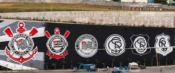
The Origin of the Corinthians Emblem
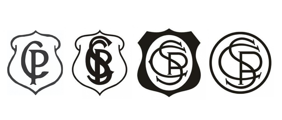
In 1913, the Corinthians needed an emblem to compete for a spot in the Paulista Championship, as an agreement among elite clubs allowed the selection of teams from lower categories. Thus, the first emblem emerged, simply featuring the initials "C" and "P", representing Corinthians Paulista, in black and overlapping.

With this emblem, the Timão faced teams such as Minas Gerais and São Paulo FC, securing its participation in the championship. It was during this time that the club earned the nickname "People's Team", which remains to this day, as it was the only team in the league that allowed working-class individuals to play, with its supporters also composed of workers.
The Second Change to the Corinthians Emblem
The first emblem with the initials "C" and "P" did not last long, being altered in 1914. In the two matches against Torino, the design was modified, with the "C" taking on the shape of a horseshoe, representing the club's field, while the letter "P" was filled with black, creating an interwoven effect.

The Period of Changes to the Corinthians Emblem
Between 1914 and 1919, the Corinthians emblem underwent various changes. There were four modified versions, although minor. The adopted format was medieval style, predominantly black and white.
The Inclusion of the Flag
However, in 1919, the Corinthians emblem underwent a significant change. Now, the flag of the state of São Paulo along with the club's name and founding date became part of the symbol. Twenty years later, the first anchor, oar and ball appeared on the uniform.
Although these elements had already been incorporated since the purchase of the land for Parque São Jorge in 1926, the new design began to suggest aquatic sports. This emblem was even drawn on the facade of the Estádio Ponte Grande.

Significant Change
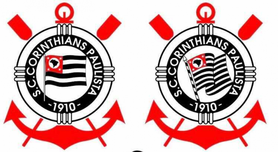
In 1980, the Corinthians emblem underwent a major overhaul. The 13 stripes of the flag of the state of São Paulo were redesigned, taking on a wavy shape, symbolizing energy and movement. Additionally, the details of the emblem were enhanced, with reflections on the oars and anchor, the replacement of the buoy with a rowing rope, and the addition of black outlines, making the symbol more refined.
Eight years later, the second star was added, representing the second championship title. With the next championship won, the third star was incorporated the following year. In 2000, upon winning the Club World Cup, the Corinthians earned a larger star on the emblem, symbolizing its great achievement. In 2005, the fourth star emerged with the victory in the Brazilian Championship, completing the final customization of the emblem.
The Final Corinthians Emblem
Starting in 2011, the stars were removed from the Corinthians emblem, ending over 20 years of their presence in the symbol. The official explanation was that all titles have a special meaning, and it is no longer necessary to differentiate them by stars. The new emblem was officially presented on January 15, 2012, during a friendly match against Flamengo, which ended in a 2-2 draw.
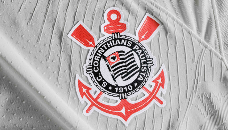
Since then, the Corinthians emblem has not undergone further changes. However, in 2019, during a match against Fortaleza, the club carried out a marketing action, placing the stars back on the shirt in honor of Jews persecuted by Nazism. The action took place on November 9, the day of the Night of Broken Glass in 1938.
Who Designed the Corinthians Emblem?
Exactly 120 years ago, on August 22, 1902, an important figure in the history of the Corinthians was born: Francisco Rebolo. Between 1921 and 1927, the painter and player of the Timão was responsible for creating the final version of the emblem.
Why Does the Corinthians Emblem Have Red Color?
The emblem with the anchor and red oars is a relatively new version, dating back to 1939. The color design was inspired by the flag of the state of São Paulo, which was introduced in the 1920s, meaning that the colors were purely visual and do not carry meanings beyond aesthetics.

Throughout its 120 years of history, the Corinthians emblem is not just a symbol of the team's glory, but also a testament to its culture and spirit. From the simple “C” and “P” to the current emblem with its deep meaning, each change reflects the progress and evolution of the Corinthians over time. They represent the profound connection between the club and its supporters, as well as a commitment to history, tradition, and social responsibility.

