The Manchester City logo is more than a badge; it’s a timeline of the club’s rise from a church team in 1880 to a global football powerhouse.
Each iteration tells a story of community, controversy, and ambition, proving that a crest can define a team’s soul.
Follow BRG365 to explore More logo stories.
Introduction: The Logo as a Living Legacy
For over a century, the Manchester City logo has been more than a symbol—it’s a mirror to the club’s heart and the city’s spirit.
From the simple cross of its church roots to the sleek modern design adored by fans in 190 countries, every version of the Manchester City logo marks a chapter in Manchester City’s journey.
This is how a logo became a legend, stitching together history, identity, and global fame.
The Church Years(1880–1887)
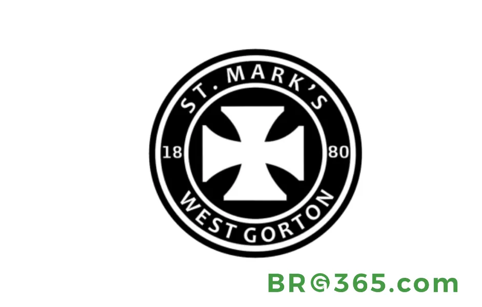
The first Manchester City logo emerged in 1880, reflecting the club’s origins as St. Mark’s (West Gorton).
The black-and-white circular badge featured a bold white cross pattée on a black background, inspired by the stained-glass windows of St. Mark’s Church.
A double white border encircled the emblem, with “St. Mark’s West Gordon” in all-cap sans-serif text and the founding year “1880” dividing the wordmark. This simple, monochromatic design symbolized the team’s religious roots and community identity.
Read More: Manchester City's All-Time Best XI: Legends Who Defined a Football Dynasty
The Birth of Sky Blue (1887–1894)
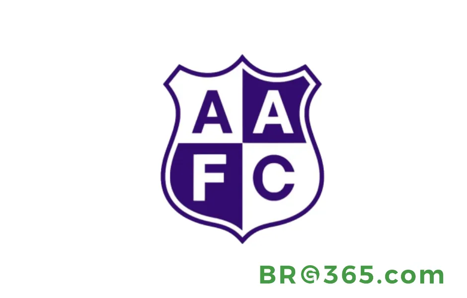
Renamed Ardwick Association Football Club in 1887, the club adopted a blue-and-white quadrant shield—a precursor to the modern Manchester City logo’s color palette.
The badge, divided into four segments, displayed “AAFC” (Ardwick Association Football Club) with blue letters on white and white letters on light blue.
This traditional crest shape marked the first use of sky blue, a color that would become synonymous with the club, and signaled its shift from a church team to a local athletic association.
The Victorian Coat of Arms(1894–1960)
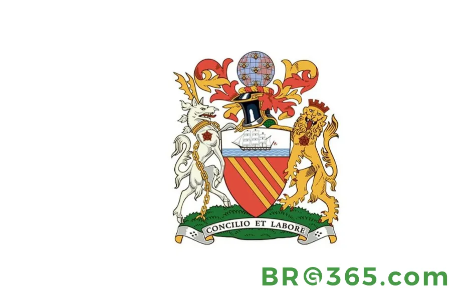
In 1894, as “Manchester City FC” was born, the club embraced Manchester’s official coat of arms as its logo.
The orange shield featured three yellow diagonal lines (representing the Medlock, Irk, and Irwell rivers) and a golden clipper ship (honoring the Manchester Canal’s trade legacy).
Flanked by a white deer (Lancashire) and golden lion (Manchester), the crest included a knight’s helmet, globe, and bees—symbols of industry.
This elaborate Victorian design endured for decades, though its complexity led to simplifications in later years.
The 1960s: Modernization Begins
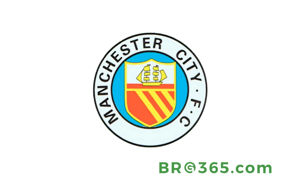
The 1960s brought the first major simplification of the man city logo.
The orange-yellow shield was placed on a light blue background, encircled by a thick black-and-white border with bold sans-serif text (“Manchester City FC”).
The clipper ship, now yellow on a white-orange backdrop, retained its symbolic link to trade, while the removal of peripheral elements (deer, lion) streamlined the design for better visibility, key as football entered the television era.
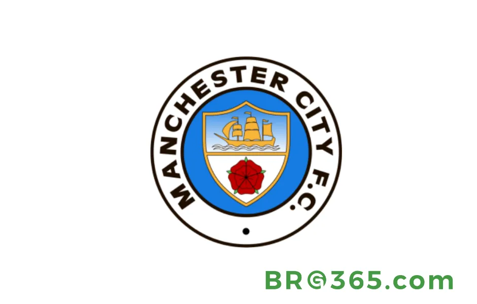
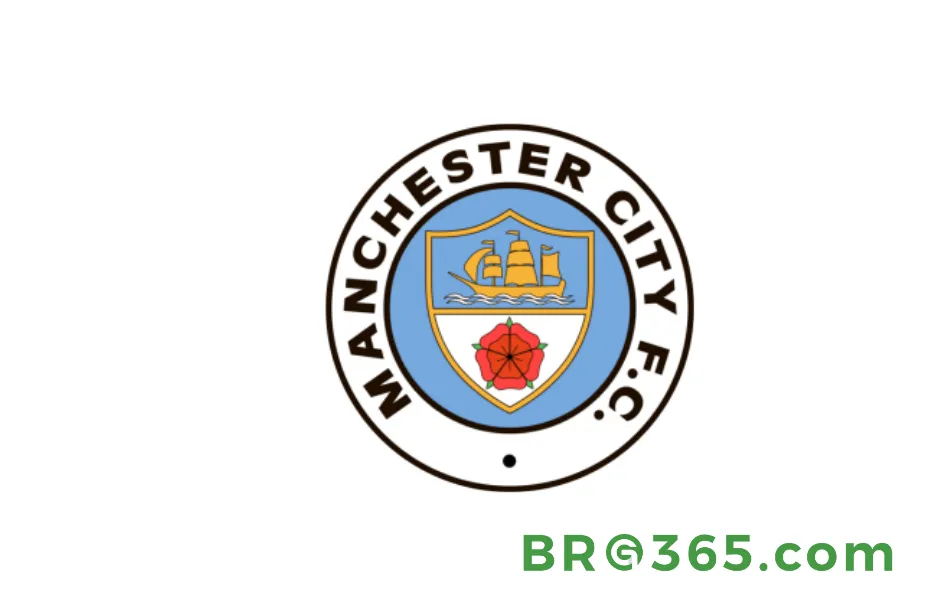
The Red Rose Era (1972–1976 & 1981–1997)
1972–1976
In 1972, the man city logo underwent a landmark change: the Lancashire red rose replaced the yellow diagonal lines, symbolizing regional pride and distinguishing the club from Manchester United (tied to Cheshire).
The shield, outlined in gold, sat on a light blue background with a bold sans-serif wordmark.
The clipper ship moved to a blue backdrop, creating a cohesive palette of blue, gold, and red colors that resonated deeply with local fans.
1981–1997
A 1981 refresh added gradient blue-and-white shades to the shield, enhancing depth and modernity, while the internal circle brightened to a vibrant sky blue.
The wordmark and black dot at the bottom remained, creating continuity with the 1972 design.
This version, used for 16 years, balanced tradition with subtle innovation, becoming a fan favorite for its sleek, three-dimensional aesthetic.
The Eagle Era (1997–2016)
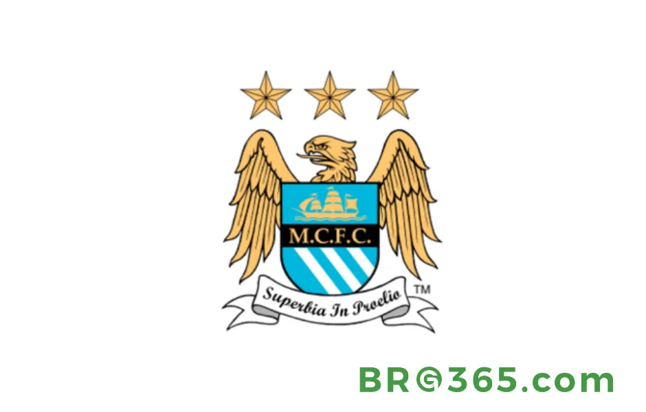
By 1997, copyright issues forced a radical redesign. Out went tradition; in soared the golden eagle, clutching a blue shield with white stripes.
Three stars debuted (initially for three league titles, though critics mocked their static number as the club won more), and the Latin motto “Superbia in Proelio” (“Pride in Battle”) added a touch of drama.
Love It or Hate It, but Unforgettable
This Man City logo divided fans—some saw it as a bold, modern leap for a club eyeing European glory (jersey sales tripled under the Abu Dhabi owners), while others missed the rose’s local charm.
Yet, it worked: the eagle became a global symbol, appearing on billboards in New York and Tokyo, proof that a logo could fuel a brand’s rise.
Read More: Kevin De Bruyne: The Pulse of Manchester City
Return to Roots(2016–Present)
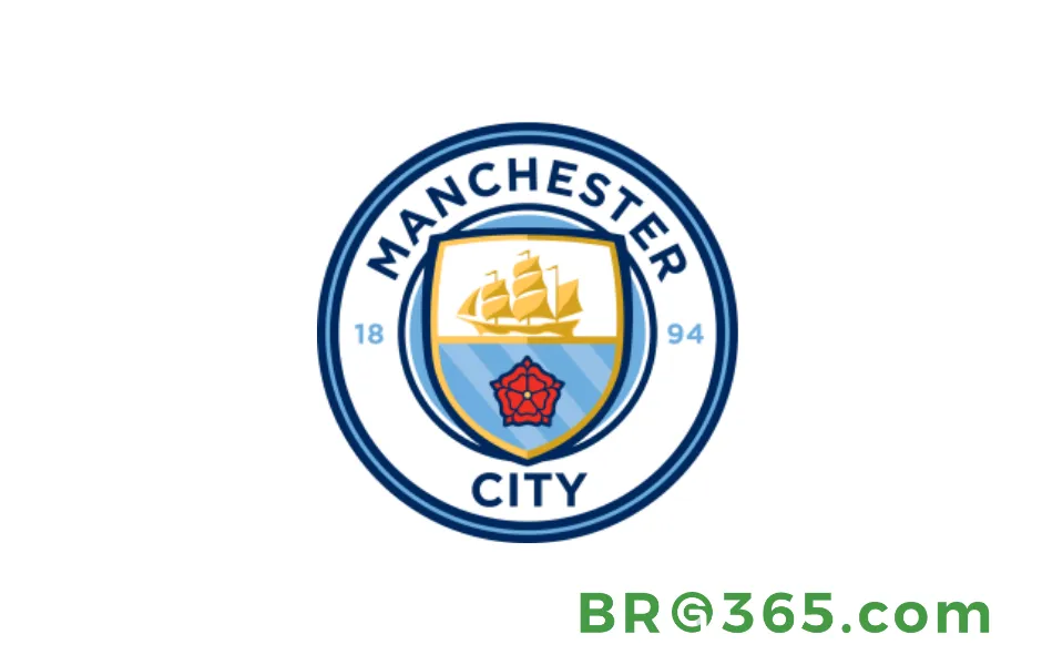
In 2016, fan feedback won. The club ditched the eagle, reviving the circular shape and merging history with modern design.
The new Man City logo features a golden ship (trade heritage) and red rose (Lancashire pride) on a sky-blue shield, with “1894” honoring its founding year.
The result? A crest that feels both vintage and fresh, perfect for Instagram and stadium screens alike.
Fan-Driven Design
Fans voted on key elements: 94% chose blue, 67% wanted the three rivers, and 60% insisted on the rose. The payoff?
The 2016 logo jersey became the club’s fastest-selling ever, shifting 1.2 million units in its first year, and social media posts featuring the logo earned 40% more engagement—proof that nostalgia sells.
The Logo as a Global Brand Tool
Today, the Man City logo is a masterclass in consistency:
-
Color Power: Sky blue (Pantone 300) is instantly recognizable, used everywhere from kits to the Etihad Stadium’s seats.
-
Minimalist Magic: The simple circle and core elements make it adaptable, whether on a tiny phone screen or a 50-story skyscraper in Dubai.
-
Fan Bond: Tattoo parlors worldwide report a surge in Man City logo ink, from the rose to the golden ship, a testament to its emotional weight.
More Than a Crest—A Legacy
The Man City logo’s journey is a story of evolution: from a church cross to a global icon, each design reflects the club’s soul—proud of its past, brave in its choices, and united with its fans.
As Pep Guardiola’s team chases trophies, the logo on their chests is more than a symbol; it’s 143 years of dreams, defeats, and defiance, stitched into every stitch of the sky-blue jersey.
For Manchester City, the Man City logo isn’t just part of the uniform—it’s the heart of the team, beating in sync with fans from Manchester to Mumbai.
And that is the magic of a great crest: it doesn’t just represent a club; it is the club, in blue and gold, for all time.